In today's data-driven world, the ability to quickly interpret and act on complex information is crucial. Enter heat maps – a powerful visualization tool that transforms raw data into intuitive, color-coded representations. From optimizing websites to advancing scientific research, heat maps offer invaluable insights across diverse fields. This comprehensive guide explores the world of heat maps, their applications, and how to harness their potential to drive decision-making and improve user experiences.
Understanding Heat Maps
What Are Heat Maps?
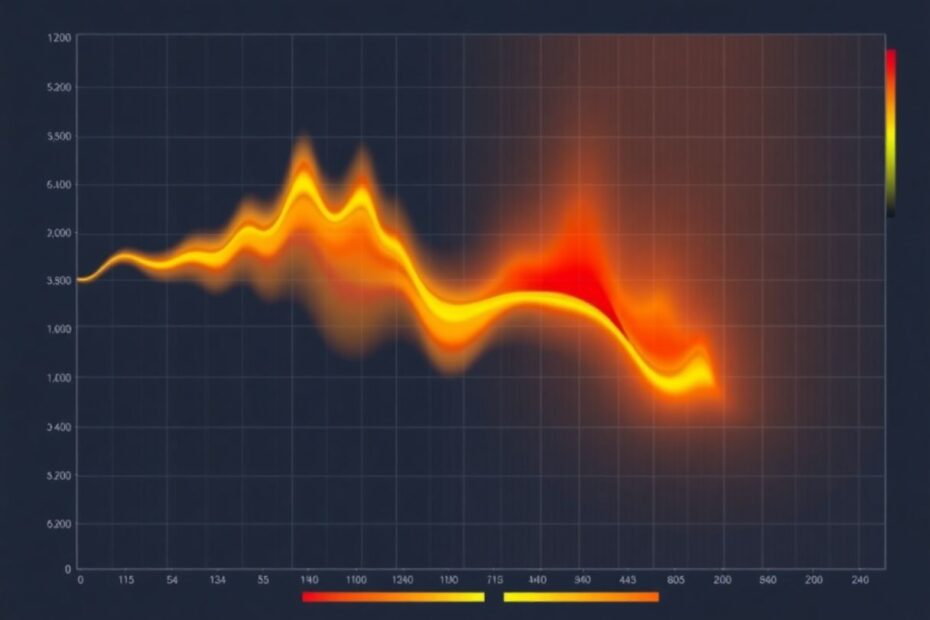
Heat maps are graphical representations of data where individual values are depicted as colors. Typically, the spectrum ranges from cool colors (blues and greens) representing lower values to warm colors (yellows and reds) indicating higher values. This intuitive color-coding allows for quick visual interpretation of complex datasets.
The Evolution of Heat Maps
The concept of heat maps has roots dating back to the 19th century, with early examples found in statistical matrices. However, the term "heat map" was coined in the 1990s by software designer Cormac Kinney, who created the visualization to display real-time financial market information. Since then, the use of heat maps has exploded across various industries, driven by advancements in data analytics and visualization technologies.
How Heat Maps Work
Heat maps function through a simple yet powerful process:
- Data Collection: Gathering relevant data points from various sources
- Value Assignment: Assigning color values based on data intensity or frequency
- Visual Overlay: Mapping these colors onto a visual representation (e.g., a website layout or geographical map)
- Pattern Revelation: Presenting a comprehensive view of data distribution and patterns
This process transforms complex datasets into easily digestible visual information, enabling quick identification of trends, hotspots, and areas of interest.
Types of Heat Maps
Click Maps
- Purpose: Show where users click or tap on a webpage
- Benefits:
- Identify popular interactive elements
- Reveal non-intuitive user behavior
- Optimize button and link placement
Example: A retail website using click maps might discover that users frequently click on product images, expecting them to enlarge. This insight could lead to implementing a zoom feature, improving user experience and potentially increasing sales.
Scroll Maps
- Purpose: Visualize how far users scroll down a page
- Benefits:
- Determine optimal content length
- Identify where users lose interest
- Improve placement of critical information
Example: A news website might use scroll maps to discover that most readers don't make it past the halfway point of long-form articles. This could prompt a redesign with more engaging subheadings or the addition of interactive elements to maintain reader interest.
Mouse-tracking Heat Maps
- Purpose: Display mouse movement and hover patterns
- Benefits:
- Understand user attention and interest areas
- Optimize content layout for better engagement
- Identify potential distractions or confusing elements
Example: An e-commerce site might use mouse-tracking to notice users frequently hovering over shipping information. This could lead to making shipping details more prominent or offering a shipping calculator to address user concerns proactively.
Attention Heat Maps
- Purpose: Combine click, scroll, and mouse-tracking data
- Benefits:
- Provide a comprehensive view of user interaction
- Identify areas of high engagement and potential improvement
- Guide overall page design and content strategy
Example: A SaaS company might use attention heat maps on their pricing page to understand which features users focus on most. This could inform decisions on feature highlighting or pricing structure adjustments.
Segmented Heat Maps
- Purpose: Analyze behavior of specific user groups
- Benefits:
- Tailor experiences for different demographics
- Identify varying behaviors across devices or regions
- Refine targeting and personalization strategies
Example: An international travel website might use segmented heat maps to compare how users from different countries interact with their booking process, allowing for culturally tailored user interfaces.
Applications of Heat Maps
Web Design and UX Optimization
Heat maps have revolutionized the way designers and UX professionals approach website optimization:
- Identifying Popular Content: Heat maps highlight which elements attract the most attention, allowing designers to prioritize and optimize these areas.
- Optimizing Navigation: By analyzing click patterns, designers can improve menu structures and site architecture to align with user behavior.
- Enhancing Call-to-Action Placement: Heat maps reveal optimal locations for CTAs, potentially increasing conversion rates.
Case Study: Spotify used heat map analysis to redesign its homepage, resulting in a 73% increase in playlist creation and a significant boost in user engagement.
E-commerce Optimization
In the competitive world of online retail, heat maps offer critical insights:
- Improve Product Placement: Arrange items based on user attention patterns to maximize visibility of key products.
- Optimize Checkout Processes: Streamline the buying journey by identifying and eliminating friction points.
- Enhance Product Descriptions: Focus on areas where users spend the most time reading to improve product information delivery.
Case Study: Amazon continuously uses heat map data to refine its product pages, contributing to its industry-leading conversion rates of around 13% for Prime members.
Scientific Visualization
Heat maps have become indispensable in various scientific fields:
- Genetics: Visualize gene expression data across different conditions or tissues.
- Climate Science: Represent temperature and precipitation patterns over time and geography.
- Neuroscience: Map brain activity and neural connections in response to stimuli.
Example: The Human Connectome Project uses heat maps to visualize brain connectivity, leading to groundbreaking insights into neurological disorders and human cognition.
Business Intelligence
In the corporate world, heat maps assist in:
- Sales Analysis: Visualize sales performance across regions, products, or time periods.
- Risk Assessment: Identify areas of high risk in financial models or supply chain operations.
- Customer Segmentation: Map customer behaviors and preferences for targeted marketing strategies.
Case Study: IBM's Watson uses heat map visualizations to help businesses identify potential supply chain disruptions, enabling proactive risk management.
Sports Analytics
Heat maps have found their way into sports analysis, offering new perspectives on performance:
- Player Movement: Track and analyze player positions and movements during games.
- Shot Analysis: Visualize shooting patterns and effectiveness in basketball or football.
- Game Strategy: Identify team formation patterns and defensive weaknesses.
Example: The NBA uses heat maps to analyze player shooting efficiency, influencing coaching strategies and player development programs.
Creating Effective Heat Maps
Choose the Right Data
- Ensure data relevance to your objectives
- Consider sample size for statistical significance (generally, a minimum of 2000-3000 pageviews for website heat maps)
- Clean and prepare data to avoid misleading visualizations
Select Appropriate Color Schemes
- Use intuitive color gradients (e.g., blue to red)
- Consider color-blind friendly options (approximately 8% of men and 0.5% of women experience color blindness)
- Maintain consistency across related visualizations
Provide Clear Context
- Include legends and scales
- Add descriptive titles and labels
- Offer explanatory notes where necessary
Consider Interactivity
- Implement zoom and pan functions for detailed exploration
- Add hover-over information for specific data points
- Allow toggling between different data sets or time periods
Tools for Creating Heat Maps
Web Analytics Tools
- Hotjar: Offers comprehensive website heatmaps and user recordings
- Crazy Egg: Provides click maps, scroll maps, and confetti reports
- Lucky Orange: Combines heatmaps with session recordings and form analytics
Data Visualization Software
- Tableau: Powerful tool for creating interactive heat maps from various data sources
- Power BI: Microsoft's business analytics tool with heat map capabilities
- D3.js: JavaScript library for creating custom, interactive data visualizations
Programming Languages
- Python: Libraries like Seaborn and Plotly for creating heat maps
- R: Packages such as ggplot2 and heatmaply for statistical heat maps
- MATLAB: Built-in functions for creating 2D and 3D heat maps
Best Practices for Heat Map Analysis
Combine with Other Data Sources
- Integrate heat map insights with traditional analytics (e.g., Google Analytics)
- Use A/B testing to validate heat map-driven changes
- Complement with qualitative data (e.g., user feedback, surveys)
Regular Updates and Monitoring
- Conduct periodic heat map analyses to track changes over time (recommended: monthly for high-traffic sites)
- Monitor the impact of website updates on user behavior
- Stay alert for sudden changes that may indicate issues or opportunities
Segment Your Analysis
- Break down heat maps by user demographics, devices, or traffic sources
- Compare new vs. returning visitor behavior
- Analyze differences between mobile and desktop users (mobile users now account for over 50% of web traffic)
Focus on Action Items
- Prioritize findings based on potential impact (use frameworks like ICE: Impact, Confidence, Ease)
- Develop specific, actionable recommendations
- Create a roadmap for implementing changes based on heat map insights
Case Studies: Heat Maps in Action
E-commerce Giant Boosts Conversion Rates
A major online retailer used click maps to optimize their product pages:
- Finding: Users frequently clicked on non-clickable product images
- Action: Made all product images clickable and zoomable
- Result: 23% increase in product page engagement and 7% boost in conversion rates
News Website Improves Content Strategy
A popular news site leveraged scroll maps to enhance reader engagement:
- Finding: 60% of users didn't scroll past the halfway point of articles
- Action: Restructured articles to front-load key information and added mid-article CTAs
- Result: 35% increase in article completion rates and 18% growth in newsletter signups
SaaS Company Enhances User Onboarding
A software-as-a-service provider used attention heat maps to refine their onboarding process:
- Finding: Users spent disproportionate time on certain setup steps
- Action: Simplified complex steps and added more guidance
- Result: 40% reduction in onboarding time and 25% decrease in support tickets
The Future of Heat Maps
As technology evolves, so too will the capabilities and applications of heat maps:
AI-Powered Analysis
Machine learning algorithms will enhance heat map interpretation, offering predictive insights and automated recommendations. For example, AI could analyze heat map data to predict user behavior and suggest personalized content in real-time.
Real-time Personalization
Heat maps will increasingly be used to dynamically adjust user experiences in real-time, tailoring content and layouts to individual preferences. This could lead to websites that adapt their structure based on each user's unique interaction patterns.
Virtual and Augmented Reality
As VR and AR technologies mature, heat maps will play a crucial role in optimizing immersive experiences and analyzing user interactions in 3D spaces. This could revolutionize fields like architectural design, where heat maps could visualize how people interact with virtual building models.
Internet of Things (IoT) Integration
Heat maps will be applied to data from IoT devices, providing insights into physical spaces and human behavior in the real world. For instance, retail stores could use heat maps generated from IoT sensors to optimize product placement and store layouts based on customer movement patterns.
Conclusion
Heat maps have revolutionized the way we visualize and interpret complex data sets. From optimizing website designs to advancing scientific research, their applications are vast and continually expanding. By leveraging the power of heat maps, businesses and researchers can uncover hidden patterns, make data-driven decisions, and create more engaging and effective experiences for their users.
As we look to the future, heat maps will undoubtedly play an increasingly vital role in our data-driven world. The integration of AI, real-time personalization, and IoT data will open up new frontiers in heat map applications, offering even more profound insights into human behavior and complex systems.
To harness the full potential of heat maps:
- Combine heat map analysis with other data sources for a comprehensive understanding
- Maintain a commitment to regular monitoring and updates
- Focus on deriving actionable insights that drive tangible improvements
Whether you're a web designer, data scientist, or business analyst, mastering the art and science of heat map creation and analysis can provide a significant competitive edge. As you embark on your heat map journey, stay curious, experiment with different types and applications, and always keep your end goals in sight.
The colorful world of heat maps is waiting to reveal its secrets – are you ready to unlock them and transform your approach to data visualization and decision-making?