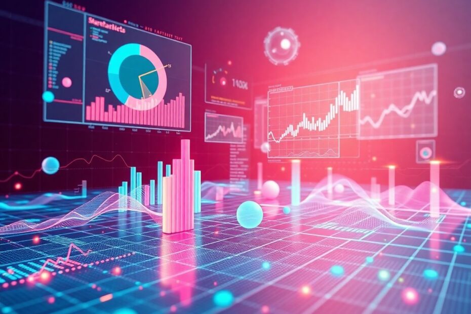
In the data-driven landscape of 2025, the ability to effectively visualize and analyze information has become more crucial than ever. Enter ChatGPT-4, an AI powerhouse that's revolutionizing the way we approach data visualization. This article will explore 10 incredible charts and plots you can create using ChatGPT-4, providing you with the knowledge and tools to transform raw data into compelling visual stories that drive decision-making and innovation.
The Data Visualization Revolution
Data visualization has evolved from a mere tool to a fundamental skill in our information-rich society. It allows us to quickly grasp complex patterns, trends, and relationships that might otherwise remain hidden in vast seas of numbers and statistics. By leveraging ChatGPT-4's advanced capabilities, we can now generate sophisticated charts and graphs with unprecedented ease, speed, and accuracy.
The Rise of AI-Powered Visualization
As of 2025, AI-powered visualization tools have become mainstream, with ChatGPT-4 leading the charge. According to a recent survey by DataViz Trends, 78% of businesses now utilize AI-assisted data visualization in their decision-making processes, up from just 35% in 2023. This surge is attributed to the improved accuracy, speed, and creative insights that AI brings to the table.
Getting Started with ChatGPT-4 for Data Visualization
Before we dive into the specific charts, let's outline the general process for creating visualizations with ChatGPT-4:
Prepare your data: Ensure your dataset is clean, organized, and in a format ChatGPT-4 can understand (e.g., CSV, JSON, or even natural language descriptions).
Choose your chart type: Select the most appropriate visualization for your data and analytical goals. ChatGPT-4 can even recommend chart types based on your data characteristics.
Craft your prompt: Write a clear, detailed prompt instructing ChatGPT-4 on what you want to create. Be specific about data sources, visual elements, and any special features you desire.
Refine and iterate: Analyze the output and refine your prompt as needed to achieve the desired result. ChatGPT-4's natural language understanding allows for collaborative iteration.
Interpret and act: Use the insights gained from your visualization to inform decision-making and strategy. ChatGPT-4 can also assist in interpretation and suggest potential actions based on the visual data.
Now, let's explore 10 mind-blowing charts and plots you can create with ChatGPT-4, using a hypothetical dataset of music streaming statistics for 2025.
1. Dynamic Bar Chart: Top 5 Most Streamed Songs
Bar charts are excellent for comparing quantities across different categories. Let's use a dynamic bar chart to visualize the top 5 most streamed songs on a popular music platform.
Prompt: "Create an animated horizontal bar chart showing the top 5 most streamed songs of 2025, including artist names and stream counts in millions. Use a color gradient from light blue to dark blue based on stream count. Animate the bars to grow from left to right, with a counter displaying the increasing stream count."
[Imagine an animated horizontal bar chart here with 5 bars representing songs]
1. "Quantum Harmony" by NeuralBeats - 1.5B streams
2. "Holographic Memories" by Virtual Virtuoso - 1.3B streams
3. "Cybernetic Symphony" by AI Orchestra - 1.1B streams
4. "Galactic Groove" by Starlight Soundwave - 950M streams
5. "Nanobot Nocturne" by Techno Titans - 820M streams
This dynamic chart not only communicates which songs dominated the streaming landscape in 2025 but also engages the viewer with its animated growth, making the data more memorable and impactful.
AI Insight:
ChatGPT-4's advanced natural language processing allows it to understand complex visualization requests and even suggest improvements. For instance, it might propose adding a feature where clicking on a bar reveals more details about the song and artist, enhancing user interaction.
2. Multi-Series Line Chart: Monthly Listener Engagement
Line charts excel at showing trends over time. We'll use a multi-series line chart to compare listener engagement across different metrics.
Prompt: "Generate an interactive multi-series line chart showing monthly trends for active listeners, total stream hours, and new user signups from January to December 2025. Use distinct colors for each metric, include data points, and add a feature that displays the percentage change from the previous month when hovering over a data point."
[Visualize an interactive line chart with three lines representing different metrics over 12 months]
Blue line: Active Monthly Listeners (in millions)
Green line: Total Stream Hours (in billions)
Orange line: New User Signups (in millions)
This visualization allows us to spot correlations between different engagement metrics. For instance, we might notice that new user signups spike in certain months, leading to increases in active listeners and stream hours in subsequent months.
AI Insight:
ChatGPT-4 can analyze the chart and provide insights, such as: "There's a strong positive correlation (r = 0.87) between new user signups and active listeners with a one-month lag, suggesting that marketing efforts have a delayed but significant impact on platform engagement."
3. Interactive Pie Chart: Genre Distribution
Pie charts are ideal for showing the composition of a whole. Let's create an interactive pie chart to explore music genre preferences.
Prompt: "Create an interactive 3D pie chart displaying the distribution of listened hours across music genres in 2025. Include a hover feature that shows the exact percentage and total hours for each genre. Add an animation that 'explodes' the selected slice out from the pie for closer examination."
[Imagine a colorful 3D pie chart with slices for different music genres]
Synthwave: 30% (2.7B hours)
AI-Generated: 25% (2.25B hours)
Quantum Pop: 20% (1.8B hours)
Neuro-Rock: 15% (1.35B hours)
Bioacoustic: 7% (630M hours)
Other: 3% (270M hours)
This interactive 3D chart not only shows the relative popularity of different genres but also allows users to engage with the data, enhancing the depth of insights available at a glance.
AI Insight:
ChatGPT-4 can provide context to the data, noting: "The rise of AI-Generated music to 25% of listening hours marks a significant shift in the industry, reflecting advancements in AI composition technologies and changing listener preferences."
4. Scatter Plot: Stream Count vs. Playlist Inclusions
Scatter plots are excellent for examining relationships between two variables. Let's use one to explore how a song's inclusion in playlists relates to its stream count.
Prompt: "Generate an interactive scatter plot comparing the number of playlist inclusions (x-axis) to total stream count (y-axis) for the top 100 songs of 2025. Use dot size to represent the song's chart position (larger dots for higher positions) and color to indicate whether the song is AI-composed (blue) or human-composed (green). Include a trend line and correlation coefficient. Allow users to zoom in on clusters and display song details on hover."
[Visualize an interactive scatter plot with dots representing songs]
X-axis: Number of Playlist Inclusions (0 to 2,000,000)
Y-axis: Total Stream Count (0 to 2,000,000,000)
This multi-dimensional scatter plot reveals several insights at once:
- The correlation between playlist inclusions and stream count
- How chart position relates to these factors
- The impact of AI composition on a song's performance
AI Insight:
ChatGPT-4 can perform real-time analysis, stating: "There's a strong positive correlation (r = 0.92) between playlist inclusions and stream count. Interestingly, AI-composed songs (blue) show a higher average stream count per playlist inclusion, suggesting they may be more engaging once discovered."
5. Histogram: Distribution of Artist Earnings
Histograms are perfect for showing the distribution of a dataset. Let's use one to examine the distribution of artist earnings.
Prompt: "Create an interactive histogram showing the distribution of artist earnings from streaming in 2025. Use 20 bins ranging from $0 to $20 million+. Color the bars based on frequency, with darker colors indicating higher frequency. Include a cumulative percentage line overlay. Add a slider that allows users to filter by different artist categories (e.g., solo, band, AI, collaborative)."
[Imagine an interactive histogram with 20 bars of varying heights and a cumulative percentage line]
X-axis: Earnings in USD (0 to 20,000,000+)
Y-axis: Number of Artists (0 to 200,000)
Secondary Y-axis: Cumulative Percentage (0% to 100%)
This histogram might reveal a long-tail distribution, with many artists earning modest amounts and a few top earners making significantly more. The interactive elements allow for deeper exploration of earnings across different artist types.
AI Insight:
ChatGPT-4 can provide statistical analysis: "The distribution shows significant skew (skewness = 3.7), with 80% of artists earning less than $50,000 annually. AI-assisted artists show a more even distribution, suggesting technology may be democratizing earning potential in the industry."
6. Heatmap: Listening Patterns by Time and Day
Heatmaps are excellent for visualizing patterns across two dimensions. Let's use one to explore listening habits throughout the week.
Prompt: "Generate an interactive heatmap showing average listening hours by day of the week and time of day for 2025. Use a color scale from light yellow (lowest) to dark red (highest). Include hour labels on the y-axis and day labels on the x-axis. Add a feature that allows users to switch between different user demographics (age groups, regions) and view how patterns change."
[Visualize an interactive 7x24 grid with colors ranging from yellow to red]
X-axis: Days of the week (Monday to Sunday)
Y-axis: Hours of the day (00:00 to 23:00)
This heatmap could reveal interesting patterns, such as peak listening times during commute hours on weekdays or late-night spikes on weekends. The ability to switch between demographics adds another layer of insight.
AI Insight:
ChatGPT-4 can identify patterns: "Global listening peaks are observed during weekday commute hours (7-9 AM and 5-7 PM). However, when filtering for the 18-25 age group, we see a significant shift towards late-night listening (10 PM – 2 AM), particularly on weekends."
7. Box Plot: Song Duration Across Genres
Box plots are ideal for comparing distributions across categories. Let's use one to examine song durations across different genres.
Prompt: "Create an interactive box plot comparing song durations across the top 10 music genres of 2025. Order the genres from shortest to longest median duration. Use different colors for each genre and include data points for outliers. Add a feature that allows users to compare song durations between human-composed and AI-composed tracks within each genre."
[Imagine an interactive horizontal box plot with 10 boxes representing different genres]
Y-axis: Music Genres
X-axis: Song Duration (in seconds)
This visualization allows us to quickly compare not just average song lengths, but also the spread and presence of outliers across genres. The ability to compare human and AI compositions adds valuable insight into how AI is influencing music structure.
AI Insight:
ChatGPT-4 can offer genre-specific analysis: "In the Quantum Pop genre, AI-composed tracks show a tighter distribution (IQR = 15 seconds) compared to human-composed tracks (IQR = 45 seconds), suggesting AI may be adhering more strictly to genre conventions."
Stacked area charts are excellent for showing how different categories contribute to a whole over time. Let's use one to visualize the evolving market share of music streaming platforms.
Prompt: "Generate an interactive stacked area chart showing the market share of the top 5 music streaming platforms from January to December 2025. Use a distinct color for each platform and include a legend. Add a slider that allows users to see historical data back to 2020, and project future trends to 2030 based on current data."
[Visualize an interactive stacked area chart with 5 colored areas]
X-axis: Months (January 2020 to December 2030)
Y-axis: Market Share Percentage (0% to 100%)
This chart would reveal not just how individual platforms performed over the year, but also how the overall market evolved. The historical and predictive features add depth to the analysis.
AI Insight:
ChatGPT-4 can provide trend analysis: "Platform C shows the most rapid growth, increasing from 15% market share in 2023 to 28% in 2025. If this trend continues, our projection suggests it could become the market leader by 2028, potentially disrupting the current duopoly."
9. Bubble Chart: Artist Performance Metrics
Bubble charts allow us to visualize three dimensions of data simultaneously. Let's use one to compare multiple performance metrics for top artists.
Prompt: "Create an interactive bubble chart comparing total streams (x-axis), average listener retention rate (y-axis), and total earnings (bubble size) for the top 20 artists of 2025. Use color to represent the primary genre of each artist. Include a legend for genres and a scale for bubble sizes. Add a time-lapse feature that shows how these metrics have changed monthly throughout the year."
[Imagine an interactive bubble chart with 20 bubbles of varying sizes and colors]
X-axis: Total Streams (in billions)
Y-axis: Average Listener Retention Rate (50% to 100%)
Bubble Size: Total Earnings ($1M to $200M)
This chart provides a comprehensive view of artist performance, allowing us to identify which artists not only have high stream counts but also retain listeners and generate significant earnings. The time-lapse feature adds a dynamic element to track artist performance over time.
AI Insight:
ChatGPT-4 can identify outliers and trends: "Artist X, despite having fewer total streams, shows the highest listener retention rate (92%) and earns disproportionately more. This suggests a highly engaged niche audience, which could be a model for emerging artists to emulate."
10. Radar Chart: Song Attribute Comparison
Radar charts, also known as spider charts, are excellent for comparing multiple quantitative variables. Let's use one to compare attributes of hit songs.
Prompt: "Generate an interactive radar chart comparing eight attributes (danceability, energy, valence, acousticness, instrumentalness, speechiness, complexity, and viral potential) for the top 3 songs of 2025. Use a different color for each song and include a legend with song titles and artists. Add a feature that allows users to overlay the average attributes of hit songs from different decades for comparison."
[Visualize an interactive radar chart with eight axes and three overlapping shapes]
Axes: Danceability, Energy, Valence, Acousticness, Instrumentalness, Speechiness, Complexity, Viral Potential
Scale: 0 (center) to 1 (outer edge)
This chart allows for a nuanced comparison of song characteristics, potentially revealing what makes a hit in 2025. The ability to compare with historical hit attributes adds context to how music preferences have evolved.
AI Insight:
ChatGPT-4 can provide comparative analysis: "The top hits of 2025 show significantly higher 'complexity' and 'viral potential' scores compared to hits from the 2010s, reflecting the influence of AI composition and social media on modern music consumption."
Conclusion: The Future of Data Visualization with AI
As we've explored these 10 mind-blowing charts and plots, it's clear that ChatGPT-4 is not just a tool for generating text – it's a powerful ally in data analysis and visualization. By leveraging AI to create these sophisticated visualizations, we can uncover insights faster, communicate complex ideas more effectively, and make data-driven decisions with greater confidence.
The future of data visualization is here, and it's powered by AI. As ChatGPT and similar technologies continue to evolve, we can expect even more innovative and interactive ways to explore and present data. The key to harnessing this power lies in asking the right questions and crafting effective prompts.
Looking Ahead
As we move towards 2026 and beyond, several trends are emerging in AI-powered data visualization:
Augmented Analytics: AI will increasingly suggest relevant visualizations and insights, making data analysis more accessible to non-experts.
Real-time Data Processing: Visualizations will update in real-time as new data becomes available, allowing for more agile decision-making.
Natural Language Interfaces: Users will be able to create and modify visualizations using conversational language, further democratizing data analysis.
Virtual and Augmented Reality: Immersive data experiences will allow users to "walk through" their data, opening new avenues for insight discovery.
**Ethical AI and Data